Wednesday, January 18, 2017

Art Journal #4


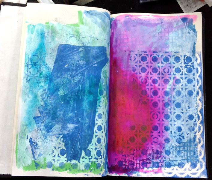
As you can see from this journal page I've added paper, napkins, and some paint to develop this abstract landscape.  I didn't begin adding paper hoping to develop a landscape but it appeared as I began painting.  And you can see the result.  The paper held up well as I layered paper and napkin sections onto the book paper with matte medium.  I used the Deco Art Media Matte Medium and was really surprised how well the book paper held up to the layers and paint application.  Interesting!  

Are you participating with me?  

Saturday, January 14, 2017

Altered Book/Journal Part 3

Now for the fun part or should I say my favorite part.  It's all actually fun or why would I be altering this book.  LOL.  Choose your stencils.  You can see a few of the stencils that I chose to use for this project.

If you look carefully you can see how I layered the stencils using random paint colors.  Layering stencils adds the impression of depth to a project.  It is one of my favorite background techniques to use on any project.  

If you take a look at the patterns on my website under the Pattern menu category, you will see how I add stenciled backgrounds.  The instructions for the finished journal in Part 1 of this series was completed for my e-book called Background Magic and provides projects all the seasons of the year.  You can find the e-book in a variety of categories under the Pattern menu.  The main focus of Background Magic is to learn to use stencils in your backgrounds to develop depth.  


How are you doing with your book?  Do you like to use stencils?  Are you like me and have too many stencils?  Leave me a comment.  Blogging can be a lonely occupation.  LOL.  


Thursday, January 12, 2017

Things I Love Part 3


I also collect tinware.  I love it!  Probably because as a child I played with tin pieces and also used them when I would cook with my mother and grandmother.  Most of these were given to me as gifts or I purchased.  As you can see I'm a fan of vintage pieces which are nostalgic for me.  

As I was taking this photo I noticed dust up in the corners, time to get busy and clean.  Do you clean or like me do you put it off????


Things I Love Part 2


If you have followed my blog for a while you know that I love bottles, that isn't a coincidence that I love bottles, I have collected them for years.  These are part of my collection, you will never see these painted.  I couldn't bear to paint these.  Many of these came to me when my grandparents moved off of their ranch.  They were kept in the cellar and I'm sure were actually used back in the day.  One of my favorites is the blue one on the left, the color of this bottle is stunning.  A few of the others were given to me by my in-laws because they knew I  loved bottles.  My mother in law has since passed away but is such a wonderful reminder of her kindness to me.  

Now I take bottles that I find interesting and upcyle them as beautiful works of art.  If you look at some of my other blog posts you will see examples of those.  

What do you collect?

Things I Love.....

Things mean memories in some instances, most of the time they are just things, but when they evoke a memory then it becomes more. I thought that I would begin sharing some things which I love and the meaning behind each piece.  
 Did any of you wear galoshes when you were growing up?  Today boots are warm and fairly efficient for keeping you warm and dry, however back in the day they were not.  I had a white pair growing up and while they were great during the fall and spring, not so much during the winter.  I'm pretty sure I had warmer boots to wear during the winter months but I don't remember those.  I just remember the galoshes.  I found these in an antique store many years ago and just had to have them.  One of these days I'm going to paint these.   Funny thing about memories.
 The apple and cat peeking out on the left were given to me by students from my teaching days, These two students were some of my favorites and obviously gave really great gifts.  The cat is painted on a rock and has sat on this shelf for almost 15 years, reminding me of a female student that I was so fond of.   The apple came from a student whose mother also taught at the school where I spent my teaching career and she is till a good friend today.

The penguin was given to me by my parents one year in my stocking probably 20 years ago.  He is ceramic and survived the raising of children in our house, he is pretty resilient.

The elf was my Grandmother's who passed away many years ago and was always kept in one of her plants.  My mother knows how I love vintage items and gave this to me about 10 years ago.  The mini measuring cup is part of my miniature collection but it seemed to like sitting in this location so has stayed here.  

Memories!!!!  Gotta love them.  How do you keep your memories alive?  


Altered Book/Journal Part 2


Choose your papers and add randomly to the journal with your favorite gluing method.  I like Deco Art Decou-Page but use what ever media you prefer.   Don't overthink paper application, these will mostly be covered over with paint.   
Get ready for the next step by picking out your paint colors and stencils.  

How are you doing?  Are you working with me?  

Tuesday, January 10, 2017

Art Journal #3


I again began with a grey and white stenciled layout, you might wonder why all the grey and white stenciling and that is because I began this process by using up some left over paint from a previous project on numerous pages in this book.  I then gessoed over the top of this with white gesso.  I'm not going to repeat the mistake from my last page.  


I added some Fluid Acrylics from Deco Art and used the Media sprays as well.


Added some white paint. Again Deco Art;  


Began applying layers of pink, turquoise and white as another layer.  


Added some dark values and some stenciling.  Too busy, need to tone this down.  

Painted over some of the darker values which I wasn't entirely happy with, needed to tone them down.  


Added more pink, turquoise, lime green as well as some dark value as stenciling.  Well with all of these layers I decided that the paper was either going to hold up or fall apart but it held up to many layers of paint.  I think I'm safe to use it as a mixed media journal. 


Added white gel pen and a little black gel pen.  I think I'm satisfied now.  All of the layers finally came together in a cohesive page.  My next problem to solve is how it stands up to adding ephemera.  

Do you do any art journaling?  Let me know what you think.   


Art Journal #2


This page spread is more involved than the previous page was. I began with a small amount of white and grey paint stenciled onto the paper and wondered if I should have used gesso first.   


I recently purchased some of the Jane Davenport Mermaid Markers and really wanted to try them out on this page and began using the blues and greens and water to move the pigment around on the paper.  I loved the look of this but unfortunately the pigment was bleeding through onto the page from the last post and I wasn't thrilled with that.  Needless to say I kind of kicked myself for not adding gesso to begin with. When I added the gesso I wasn't thrill with the look.  So I started over from square one but I definitely learned something with this process.  


I added more Mermaid marker colors, paint, and some stencil.  


Added more paint and wished that I had left it the way it was to begin with.  LOL.   When in doubt you can always add lettering to enhance the look and got out some more of my hand cut stamps and stamped the images you see below.  The lettering seemed to disappear into the background, I used my acrylic markers to block out areas around the lettering which seemed to help.  Again this art journal allowed me to solve numerous problems.  Not necessarily the composition I was going for but definitely a learning experience.  


See you in the next Art Journal post to see another page in my art journal journey.   Are you working with me?  Can't wait to see what you are doing.   


Art Journal Page #1


When I alter these books I usually give them away to friends but I decided to keep this one and use it as an art journal.  As I stated in my previous post, this book was a library book which meant that it had library quality paper for the book pages.  I wondered if I prepped the paper would it stand up to mixed media techniques?  This book is approximately 5"X 8" when closed which seemed like a good size for an art journal.  Big enough to develop a project but not so large as to be overwhelming.  

This is the first page that I completed, I did minimal work to it, just added some texture with a stencil and grey paint and then used my hand cut stamps on the page with some hand lettering and my acrylic markers to add detail.  Its not a great page for composition but an art journal isn't supposed to be a work of art, it is supposed to be a place where you can experiment.  So I was happy with it.  

The paper did pretty well,which was my main goal for this experiment, there was some bleed through from the next page that I am going to share with you which meant that I was going to need to gesso my pages before I could even begin, which is a story for the next Art Journal blog post.  

Do you do any exploration in an art journal?  

Monday, January 9, 2017

Book Fairies E-Pattern now available at www.chartmandesigns.com

How about painting these adorable book fairies on an ornament, bookmark, or even painted on a card for a personalized gift.  Why not write the recipient’s name in one of the lines on the checkout cards.  If there isn’t room white out one of the existing names before attaching it to your project.  I was able to obtain these original library checkout cards from a local library when they were switching over to a computerized system.  I love that these are actual checkout cards with actual dates and real people who checked out the books.  That certainly adds to the charm.  I scanned the library cards and have included those with this pattern, print them out on either printer paper or cardstock for a vintage look.  Why not come up with something else to use these library cards on?  Included in this pattern are 17 photos showing the painting process as well as instructions to put together a library pocket sized to fit the book marks.  What a unique and unusual gift!


Come over to www.chartmandesigns.com to see the entire pattern and purchase your copy.  

Saturday, January 7, 2017

Altered Book/Journal


I had the good fortune to obtain some old library books which were going to be thrown away.  I decided to re-purpose them and give them a new home.  I know there are those of you who cringe when you hear that an old book is going to be altered,  for those of you my second option will make you happier and that is to use an inexpensive journal which can be purchased at almost any book store.  The book in the upper photo, on the right, is an old library book while the one to the left is an inexpensive journal that I've begun the altering process on.  They will both work just as well but one will cost you some money while the other is free.

The first thing that I'd recommend you do is to reinforce the binding on the book.  My first book altering project could have been  a disaster because I didn't reinforce the binding.  That blog post can be seen in the January 2014 post.  It was a gorgeous book which I used as my calendar for the year.  The painted binding kept cracking off and I had to use a library binding tape to reinforce the areas which were cracking and that covered all of my beautiful paint job.  That is not something I would recommend.  I did some research and discovered that most artists altering books were using a white library binding tape before they began their altering journey.  You can see the roll of tape in the upper left hand corner of the photo below.  It is call Lineco Book binding tape and can be purchased online at any library supplier or at Dick Blick.  It is a little expensive but worth it.  I read online that some artists were using Duck Tape to reinforce their bindings but I read mixed reviews.  Needless to say I chose to invest in the binding tape.  

Cut a piece of binding tape the length of the binding.   I cut the tape to the length of the book and cut off any excess.  An easy way to use this tape, which has a VERY STRONG adhesive, is to lay the tape down on a flat surface with the sticky side up and place the binding side of the book down on the sticky tape and wrap your tape up along the front and back of the book.  Keep the book closed as you do this.  Lineco tape is actually made out of a fabric/linen which will allow the binding to move and stretch.  


Protect the inside of the book by placing waxed paper or deli paper in that area so you can paint and be messy.  If you are not worried about paint mess on your inside pages then no need to protect your book.  This particular book had an elastic closure on the back of the book and to protect it I wrapped masking tape on the elastic which you can see in the photo above.  Then base coat your book any color that you prefer.  I wanted to use Black Gesso to begin with.  

I have altered many books in this manner and have given them as gifts to friends who use them as sketch books or journals.  Look for more blog posts to come documenting this process.  Would you like to join me while I alter this book?  Get a book and let's get started!!!!  

Sculpting? Part Three

Usually when my father sculpts his goal is to bronze his pieces, that didn't seem terribly realistic for someone with my lack of experience.  Instead we decided that the fourth year of Father/Daughter Sculpting would be spent developing one of my characters.  We decided that we needed an inexpensive option for clay and after a little research opted to use Paper Clay.  Neither one of us had ever used it before so there was a definite learning curve.  We jumped in feet first, learning as we went.  We both agreed that it was an educational year for both of us.  The clay worked well but since we had always used oil based clay, this clay required different handling.

We decided that this guy looked somewhat like the sketch I had done, with a definite emphasis on "somewhat", but actually resembled a Gremlin more.  Thus his name is the Gremlin.  I think I should keep my day job!    Next year we will try again.  I still need to paint him and he could use some boots, however my initial instinct is to throw him away.  LOL.  Maybe this next year will give us better results.

Tuesday, August 23, 2016

Sculpting? Part Two

When my father and I sculpt we always discuss in what direction I would like to go and how to accomplish that, during our third year we decided to work on a horses head.  Horses are one of my Father's specialties and I will say his are fabulous.  It was my turn to try to make my horses head look realistic, again I'm stretching as an artist to work on realism rather than my usual illustrative style.  Isn't that what we all strive for, to stretch our artistic wings?

Imagine my surprise when my head actually resembled a horse!  It wasn't gaunt or looked like it was starving, however we still need to get the neck on the horse but that will need to wait for next year as this year we decided to change gears and try our hands at bringing one of my characters to life.  Oh my, what a learning experience for both of us.  Check back for the next installment of my sculpting challenge.  

Sculpting?

Notice in the title I added a ?  My father is an amazing sculptor, who specializes in western/wildlife art, he has won art competitions and has been in a number of galleries over his career as a bronze artist.  A few years ago I asked him if he would be willing to teach me some of his sculpting techniques and so began our yearly Father/Daughter sculpting week.

It has been a joy for me to spend time with him learning his stock in trade.  I am never going to be as proficient as he is, hence the ? mark in the title, but I do enjoy the process and enjoy the opportunity to learn a new media.  I will admit that I do not do a lot of sculpting the remainder of the year, which also indicates that I will never become as proficient as he is, but for that week that I sculpt with him I am all in and love it.

Our first two years were spent working on a sculpted head, working with an oil based clay and on an armature made out of wire.  When I say the first two years I mean it literally took me that long to develop a head which resembled a head.  The first year the head looked emaciated and gaunt, which was not my plan, the second year we spent the time fleshing out the face and building character.   I did spend a lot of time with my hands in clay, using his tools, so I guess if that is my definition I was "sculpting" and I use that term loosely.
I will say that I really liked my hat and the hair  but I never did get the eyes so I thought they looked the way they should.  For any of you who are familiar with my artwork, my style leans more toward an illustrated look rather than realism so this was a stretch for me.  

Monday, August 22, 2016

New Website at C. Hartman Designs

Well, it has been a long time since my last Blog post, I have been seriously derelict in my blogging duties.  Honestly life intervened and I had to make some choices and this was an area that I could let slide.  But I'm back now and will try to blog more often.

I recently retired from my day job, 35 years as a Public School Teacher, what an accomplishment!  It was always my plan to retire at 35 years and still have time to pursue my art career. A dream come true for sure.  I have updated my website and I'm delighted with how it turned out!!!  It is easy to navigate and so on point for current trends, the graphics are mine and were designed exclusively for me, we are planning to change out the graphics occasionally to reflect seasons or styles that I am trying to highlight.  You will need to update your bookmarked pages to see the new website, the old website is no longer available, it is still www.chartmandesigns.com just a quick change to your bookmarked pages.  I have so many great features on this site and I hope you will come on over and spend some time.  You will also need to re-register for my newsletter to continue receiving it, I have changed my carrier for my newsletter and Mail Chimp will not allow me to add my old address book without each and every one of you approving that change.  Please take the time to do that, I would love to be able to stay in contact with you.

I have a new pattern which is currently on my website called Monster Marionettes, sometimes designs just appear on the page and this is one of those designs.  I have been working on these quirky Zombie characters and decided to do a series.  I am currently working on the second in the series and I hope that you enjoy these zany characters as much as I do.

Sunday, October 25, 2015

Glass Painting Patterns

As many of you know I have been working with the Deco Art Glass Painting Markers for some time now and really feel that I have worked out all the kinks and are really doing fun things with the media. I've been asked repeatedly to develop patterns using the markers and have finally gotten that accomplished.  The glass painting patterns have numerous step by step photos showing the process of developing the project, tips and techniques for the media, as well as photos showing how to use the ornament pattern on different bottles other than those shown in the pattern photo.  We won't all have access to the same bottles and I want to give you lots of options.

You can find these two patterns on my website under the Main Menu Category Patterns Sub-Category  Glass Painting.  I think that the ornaments that I've developed with the markers are really unique and unusual and would make amazing gifts for the holidays.  Come on over and check them out and change how you glass paint.  

Christmas Elegance

I had the opportunity to participate in a group project, 12 artists completed 12 different projects which was compiled into one pattern for $9.99.  As you can see the talent was amazing and the projects are equally amazing.  You can purchase this pattern from www.decorativepaintingstore.com 

Thursday, July 16, 2015

Deco Art Glass Paint Markers New Bottles


Here it is the middle of July already and I have hardly blogged this spring.  I guess I have been really busy being productive.  I've been working on new patterns, free-lance art work, teaching a watercolor class, and of course working on my bottles.  I have quite a collection of finished pieces now.   Unfortunately my productive time will come to a close once school starts again.  "Heavy Sigh"

Here are three new bottles just finished by myself using my signature "doodled" designs.  I'm still working on these and am planning/hoping to do a juried show during the Christmas season and am keeping my fingers crossed that I will be chosen to participate.  I jokingly remarked to my husband the other day that every bottle that I finish becomes my newest favorite and these certainly fit that description.  I LOVE working on the Patron bottles, there is just such a wealth of ideas which pop into my head when working on these.  The red and black bottle seen in the first photo is from a local distillery and I adore this bottle, so Missoula, Montana!  All of my friends and family members save bottles for me, thankfully because I couldn't possibly drink all of this!  LOL!

Have you been working with the Glass Markers?  I'd love to hear how you are doing with them.  Leave me a comment.


Friday, July 10, 2015

Whimsical Watercolor on Canvas

For those of you who follow my blog and website, you know that I enjoy using different materials and combining media.  I recently purchased a sketch book at Michaels which had canvas board as the pages.  I was intrigued by the idea of using watercolor on the canvas and gave it a try, you can see the resulting image above.  I wanted to illustrate kids playing outside and these three girls seemed to be destined for the page.  The watercolor reaction on the canvas was a fun and unpredictable experience, I really needed to get the paint onto the canvas, add some shading, lift off some paint for the tints, and basically not overwork it.  I then decided that I wanted to incorporate my acrylic markers into the piece and used a combination of Molotow, Montana, and Posca pens.  If I were going to frame this under glass it would be fine however if I wanted to leave it exposed to the air I would need to seal the piece with a spray fixative.  I don't think I will ever do anything to it other than leave it in the book.

What do you think?

Wednesday, May 13, 2015

I have been publishing with the Pixelated Palette e-zine now since the September issue and have enjoyed working with Laura Haughey at Cupboard Distributing tremendously.  I'm in the process of developing a series of whimsical houses which will debut over the next few months.  This whimsical party can be found in the May issue.  Stay posted for monthly updates and join us at http://pixelatedpalette.net/ Hope to see you there!